UNICEF South Africa Annual Report: A Fusion of Stories, Data, and Authentic Design
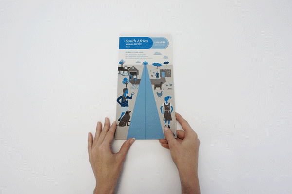
When UNICEF South Africa approached us to reimagine their annual report, they specifically asked for a fold-out design rather than the traditional booklet format. Their emphasis was on integrating their photography and transforming a significant portion of the data into engaging infographics.
In a design landscape flooded with sleek infographics, I aimed for a more authentic touch. My challenge was to seamlessly weave photography into the infographics, establishing a direct link between the data and real-life subjects. The final design served a dual purpose – one side held feedback, explanations, and a timeline of the year's events, while the reverse functioned as a poster summarizing all the data into accessible infographics. The goal was to provide a practical tool for professionals in the field, allowing them to easily reference the information by placing it on their walls.
To ensure cost efficiency, I made an early decision to work with just two colours, a choice that significantly influenced the overall art direction. Illustrations intentionally adopted an unconventional style to steer clear of the clinical perfection often associated with vector representations of people.